Understanding Typography
2 MIN READTypefaces that are selected for their style, legibility, and readability are most effective when following the fundamental principles of typographic design.
A typeface is a collection of letters. While each letter is unique, certain shapes are shared across letters. A typeface represents shared patterns across a collection of letters.

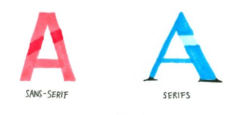
- Serifs is the small, finishing strokes on the arms, stems, and tails of characters. When a character doesn’t have the finishing strokes it’s called Sans-serif.
- Hairline is a thin stroke common to serif typefaces
- Counter is the open space in a fully or partly closed area within a letter.
- Crossbar is the horizontal stroke across the middle of uppercase ‘A’ and ‘H’.
- Stem is the main, usually vertical stroke of a letter.
- Leg is a stroke that extends downward at less than 90 degrees is a leg, as seen on the letters k, K, and R.
- Baseline is the invisible line upon which a line of texts rests. The baseline is an important specification in measuring the vertical distance between text and an element.
- X-Height refers to the height of the lowercase x for a typeface, and it indicates how tall or short each letter will be.

About the Contributor


![UNSUNG HEROES — Fred Korematsu, Karen Korematsu and Aiko Herzig-Yoshinaga are awarded the Asian American Justice Medal to recognize their fight for justice following the incarceration of Japanese Americans during World War II. In addition, scientists Shuji Nakamura, David Ho, Tsoo Wang, Mani Menon and Chih-Tang “Tom” Sah receive the Asian American Pioneer Award. "[As a scientist,] it is crucially important to be able to communicate your work and your discoveries to [not only] other scientists, but also to the general public," Ho said. Photo by Talia Boneh](https://cmagazine.org/wp-content/uploads/2025/07/useee-600x400.jpg)
