
Understanding Typography
2 MIN READTypefaces that are selected for their style, legibility, and readability are most effective when following the fundamental principles of typographic design.
A typeface is a collection of letters. While each letter is unique, certain shapes are shared across letters. A typeface represents shared patterns across a collection of letters.

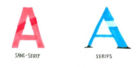
- Serifs is the small, finishing strokes on the arms, stems, and tails of characters. When a character doesn’t have the finishing strokes it’s called Sans-serif.
- Hairline is a thin stroke common to serif typefaces
- Counter is the open space in a fully or partly closed area within a letter.
- Crossbar is the horizontal stroke across the middle of uppercase ‘A’ and ‘H’.
- Stem is the main, usually vertical stroke of a letter.
- Leg is a stroke that extends downward at less than 90 degrees is a leg, as seen on the letters k, K, and R.
- Baseline is the invisible line upon which a line of texts rests. The baseline is an important specification in measuring the vertical distance between text and an element.
- X-Height refers to the height of the lowercase x for a typeface, and it indicates how tall or short each letter will be.
About the Contributor


![Polynesian Club Performs at the Cultural Celebration Assembly
[Photo Courtesy of Savannah Earley]](https://cmagazine.org/wp-content/uploads/2025/04/PNG-image-600x535.jpeg)